
You know the saying—the cobbler’s kids never have shoes.
Around here, it’s the marketer whose portfolio never quite catches up. All my clients come from word of mouth, so self-promotion takes a back seat.
The Little Warrior Foundation
Co-Founder & Creative Director
A rebellious childhood cancer foundation built from scratch. Equal parts heart and grit, it was born out of love, urgency, and a refusal to accept the status quo.
The disease space is small—fewer than 300 new diagnoses a year—but the need is enormous. In just five years, Little Warrior Foundation has raised over $10 million and is funding a first-in-human personalized vaccine clinical trial at the Cleveland Clinic, slated to open in 2026.
My Role:
Naming · Logo and visual identity ·Brand strategy & positioning · Brand voice · Visual identity · Squarespace website · UX · Events & brand activations · Speaking engagements · Social Media · Webinar host · Board secretary ·

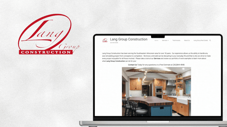
Lang Group Construction
A custom design/build firm in Wisconsin with 20 years of beautiful work—and a brand that hadn’t been updated in nearly as long. I gave their logo and website the same level of care they bring to their homes.
My Role:
Logo · Visual identity · Brand voice & copy · Squarespace website · Operational upgrades
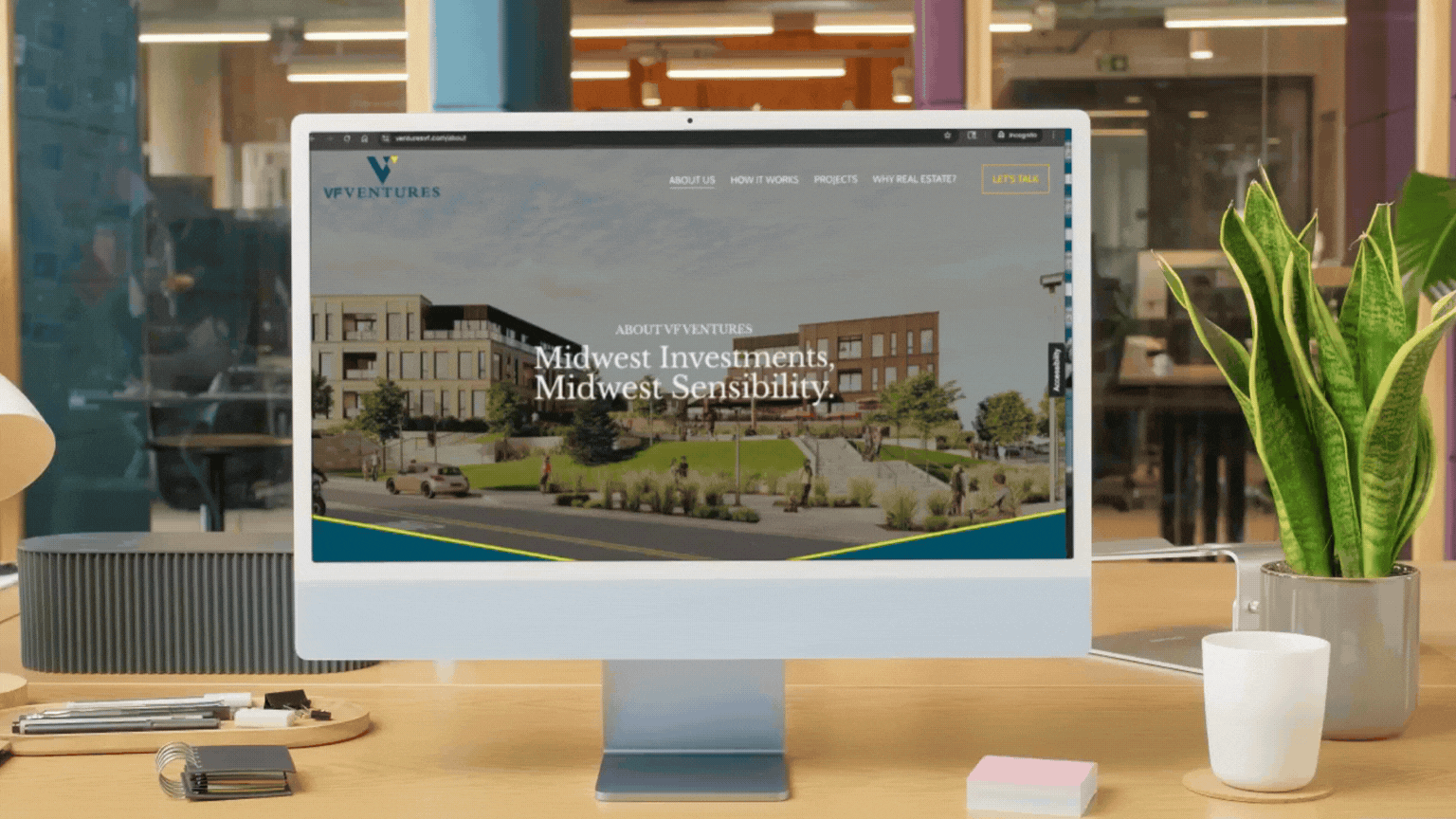
VF Ventures
Fractional real estate investing in the Midwest—built for people who want access without the headache. The challenge was creating something engaging in a new category, while navigating the very real messaging constraints that come with finance.
I built a brand that feels confident, clear, and human—serious where it needs to be, approachable everywhere else.
My Role:
Logo & visual identity · Brand voice & copy · Squarespace website · Marketing materials · Motion graphics · Template systems
Luxe Collection
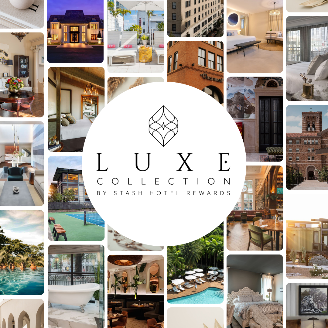
Luxe Collection is a new sub-brand of Stash Hotel Rewards, created to showcase high-end independent hotels that do luxury a little differently.
The challenge was defining a luxury expression that felt elevated but never stiff, while still feeling at home within the Stash brand.
At the heart of it all was a simple truth: the real luxury is authentic service. Attentive staff, personal touches, and experiences that feel genuinely human.
The brand signals taste, intention, and confidence—without pretension or posturing.
My Role:
Logo & visual identity · Brand voice & copy · Squarespace website · UX
Queen Anne Lutheran Church is a welcoming, affirming community grounded in Lutheran tradition and open to anyone looking for faith, connection, and belonging.
After a decade of in-house updates, their website had become unruly and no longer reflected who the parish really was. The church council recognized it was time for a digital refresh that could clearly tell their story while fitting in — and standing out — among the many new churches popping up around Seattle.
We brought clarity, warmth, and intention back to the experience—creating a site that feels welcoming, grounded, and easy to navigate for both longtime members and newcomers. And perhaps, most importantly, intuitive to update for the next decade of grace.
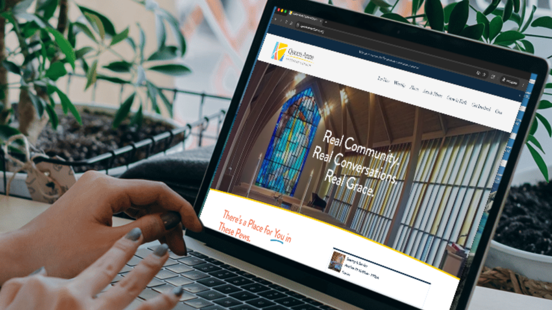
Queen Anne Lutheran Church
My Role:
Content strategy · Copywriting · UX · UI · Website build · Marketing & operations tech stack

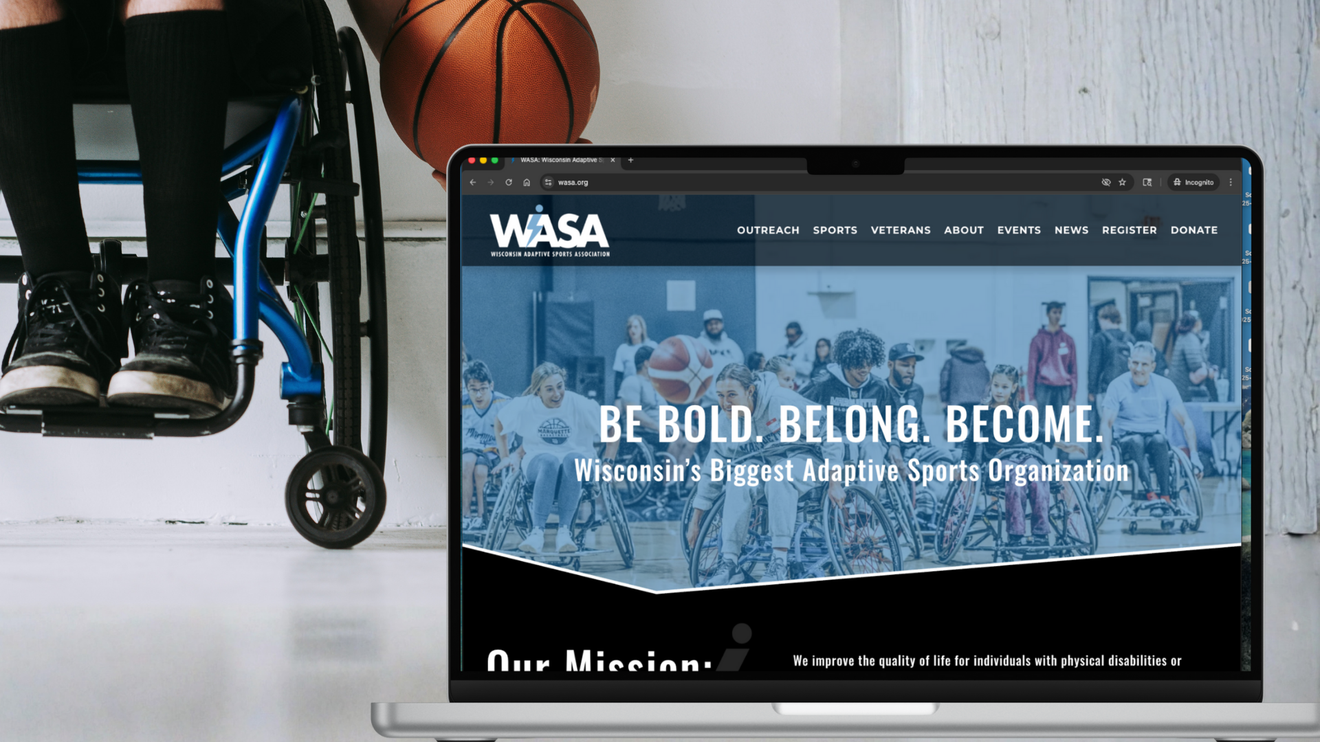
Wisconsin Adaptive Sports Association
Wisconsin Adaptive Sports Association creates opportunities for people with disabilities to move, compete, and belong—building confidence and community along the way.
Their existing website lived on a rigid sports management platform that simply wasn’t working. The technology was getting in the way of their mission—and the story they needed to tell.
I rebuilt everything from the ground up. The new site is mission-forward, flexible, and built to grow— while actually supporting the team behind the scenes. Along the way, we replaced the entire tech stack, giving marketing and operations the tools they needed to work smarter, not harder.
My Role:
Content strategy · Copywriting · UX · UI · Website build · Marketing & operations tech stack

Got a Project Brewing?
Let’s talk about it. I’ll brew some strong-yet-boring black coffee, and get to work.